
Built · São Paulo, Brazil
The Italian sandwich in São Paulo
Rua Ministro Rocha Azevedo, São Paulo — 2012–2013
- Place
- Rua Ministro Rocha Azevedo, São Paulo (Brazil)
- Year
- Design 2012, opened 2013
- Studio
- Studio Gardino Architettura, Milan
- Role
- Designed jointly with Alberto Gardino
- Scope
- Complete rebuilding of a two-storey building for an Italian sandwich bar
- Permits
- Lovisaro Arquitetura e Design, São Paulo
- Builder
- AMAC Construtora, São Paulo
- Photographs
- Matteo Gardino
- Status
- Built — opened on 28 February 2013
The place is called Brera, it is in Brazil and it sells Italian sandwiches. The name is that of a district of Milan, but the project was not drawn in Milan: my father and I did it in São Paulo, in a space rented for those months.
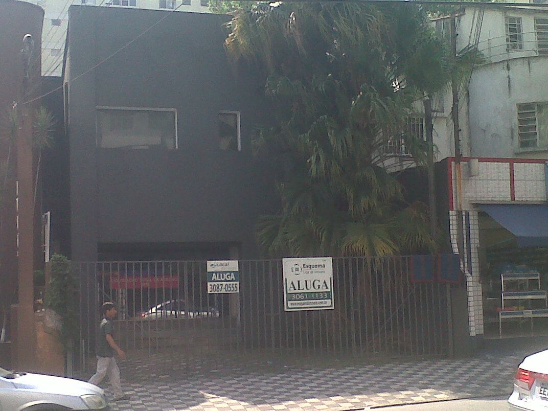
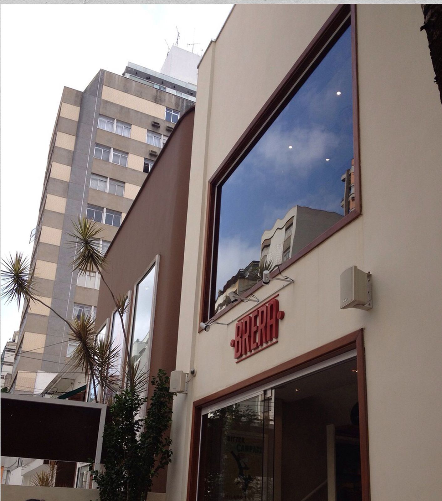
Before, there was a narrow, deep two-storey building, empty, shut behind railings among the apartment blocks of the Jardins. Two aluga signs hanging on the railing.
All the machinery upstairs
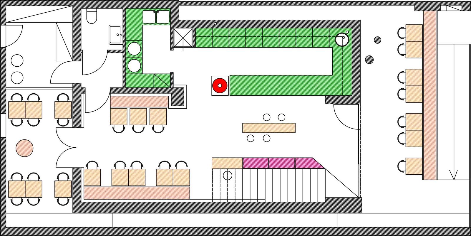
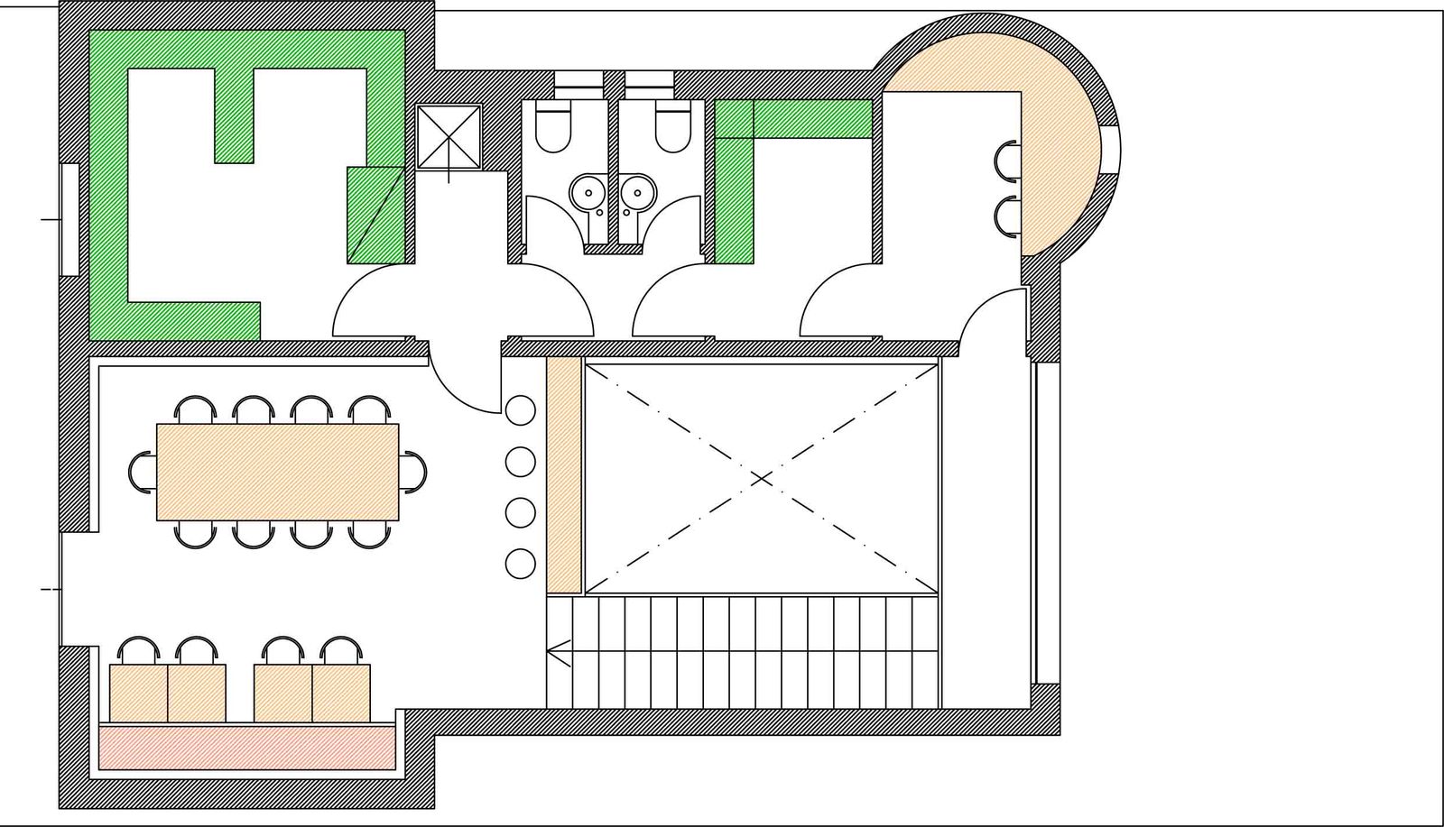
A place like this is made of two halves you never see together: the room, and the machine that keeps it running. In a narrow building the temptation is to squeeze both onto the ground floor, and end up with each pressed against the other.
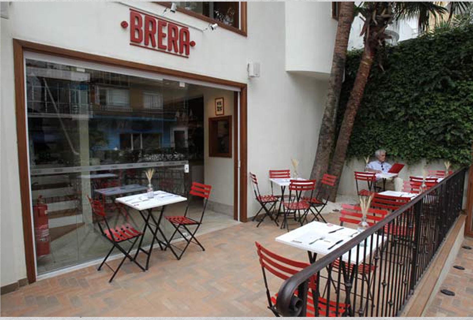
Here we did the opposite. On the ground floor there is only what the customer walks through: an outside terrace, an inside one, the main room and the counter. Everything else is upstairs — a smaller room, the lavatories, the office, the staff rooms, the changing room and the cold store.
The outside terrace, moreover, did not exist before. It was made at the front, where the little yard behind the railings had been: you give up some covered floor area to gain the one thing a place like this really needs, which is to be seen while it is full.
The void and the shelving
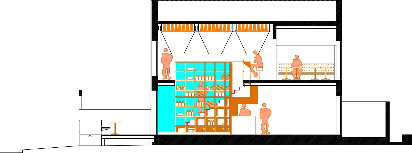
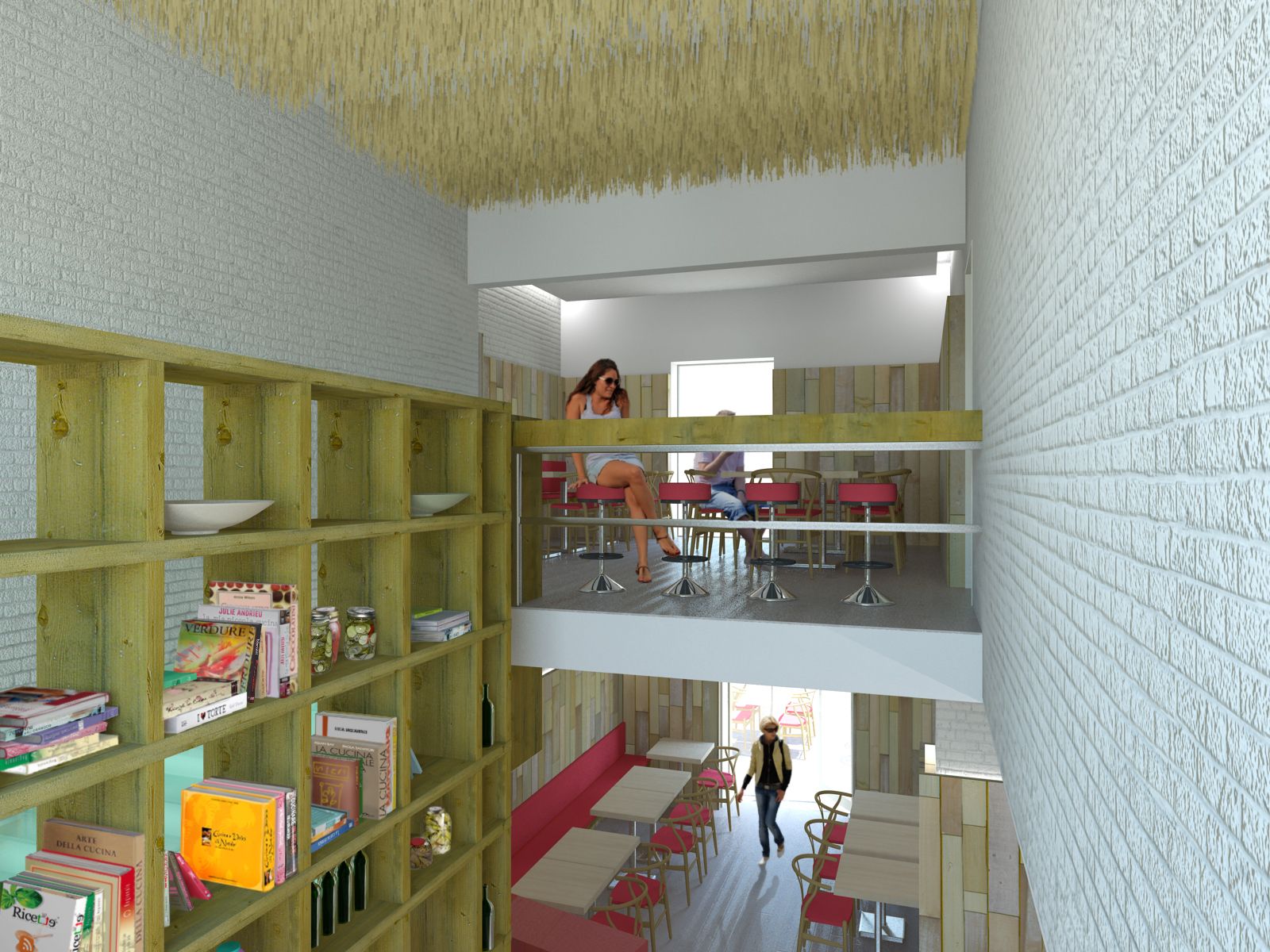
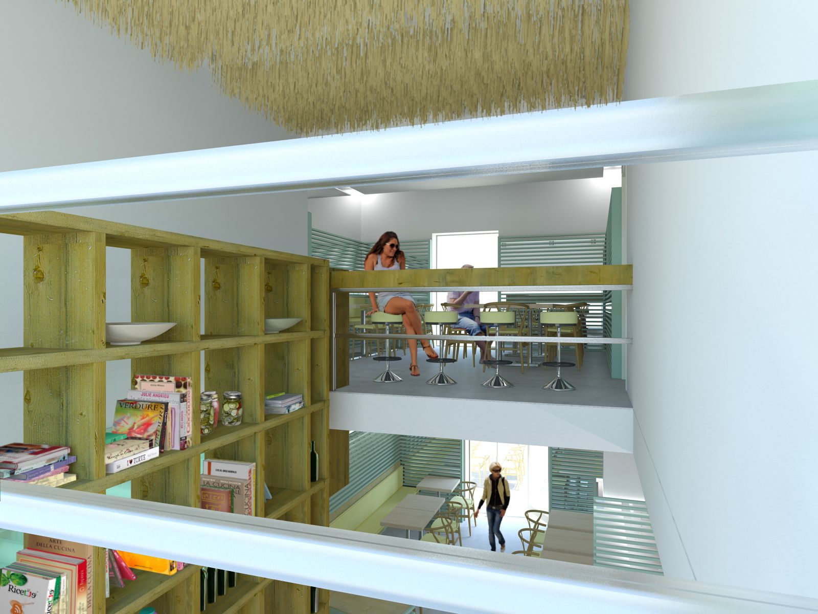
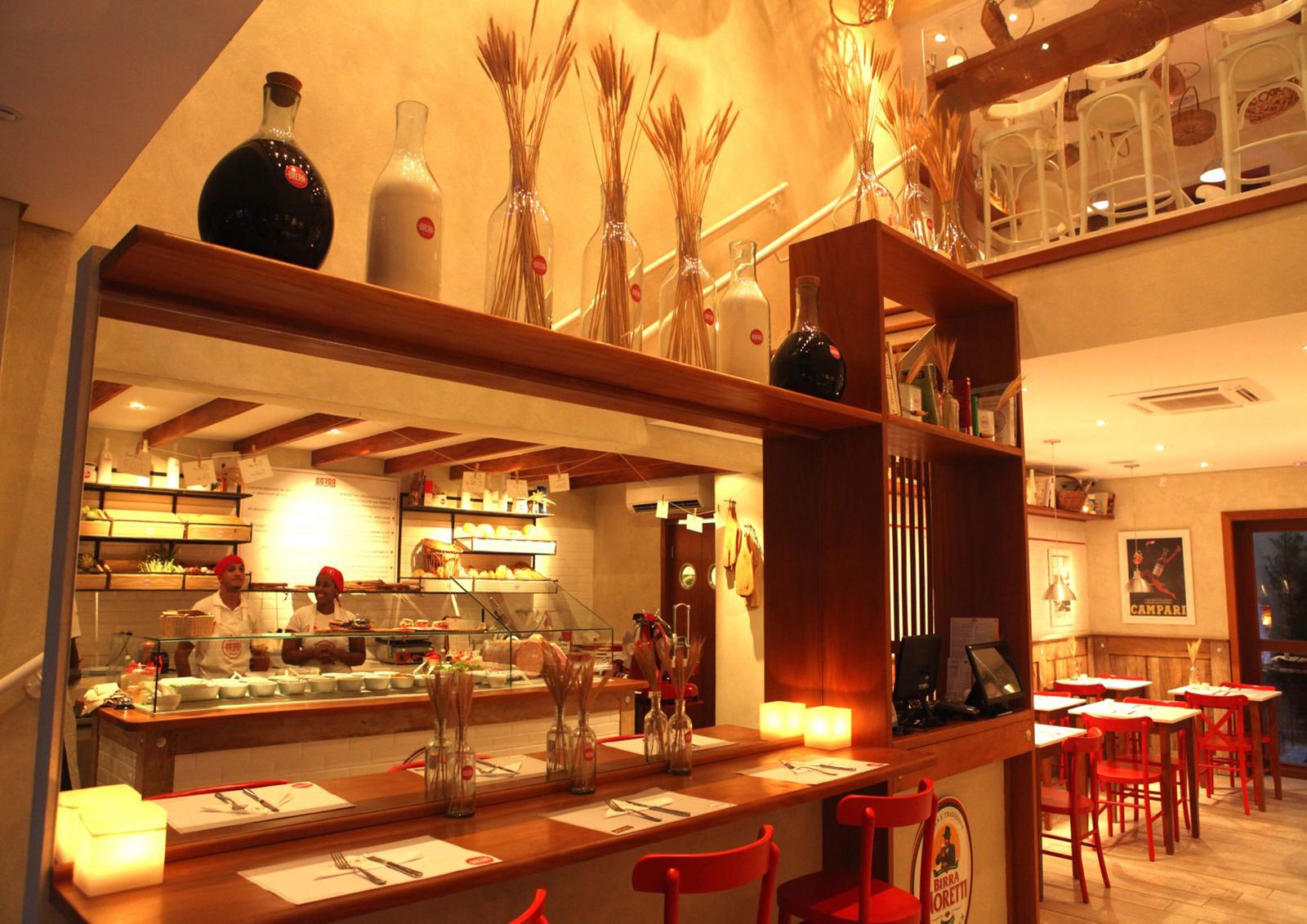
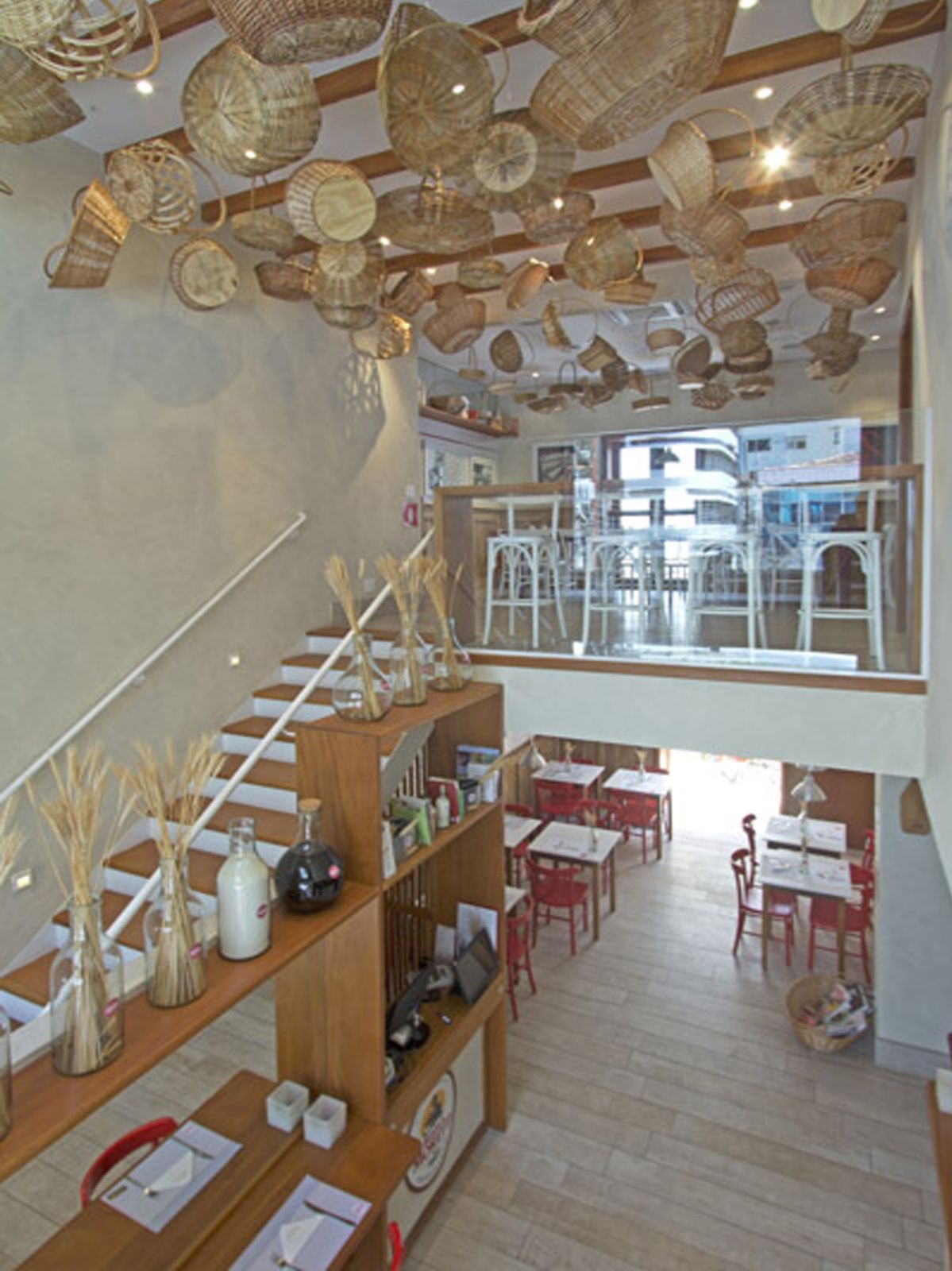
The two floors are not two rooms stacked on each other: they are tied together by a double-height void open onto the main room, and through that void runs the piece that holds the whole project together — a two-storey wall of pigeonhole shelving.
It does three things at once. From below it is the backdrop of the room, full of jars and bottles; from above it is the balustrade of the small upper room; and for anyone climbing the stairs it is the wall alongside, with the pigeonholes at eye level. One element, three jobs: it is the way of working that comes back on almost every one of these pages.
The same place, twice
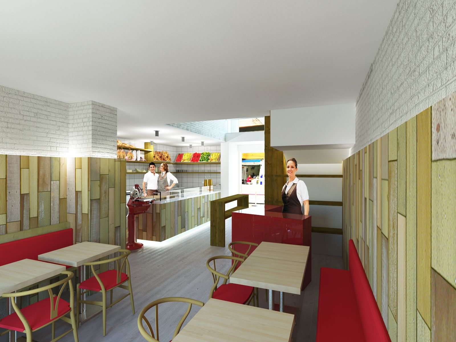
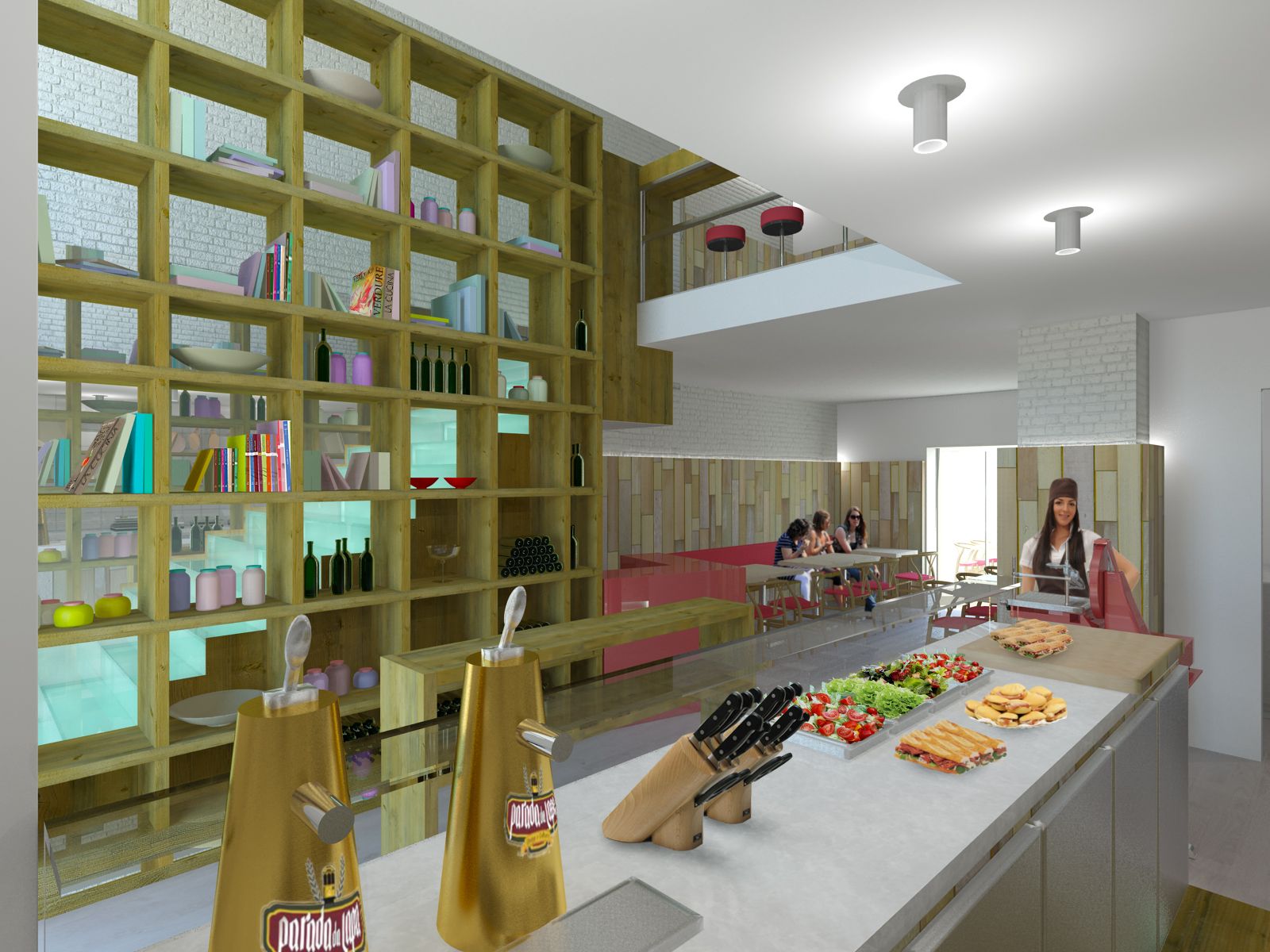
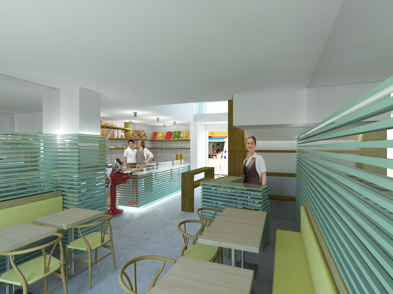
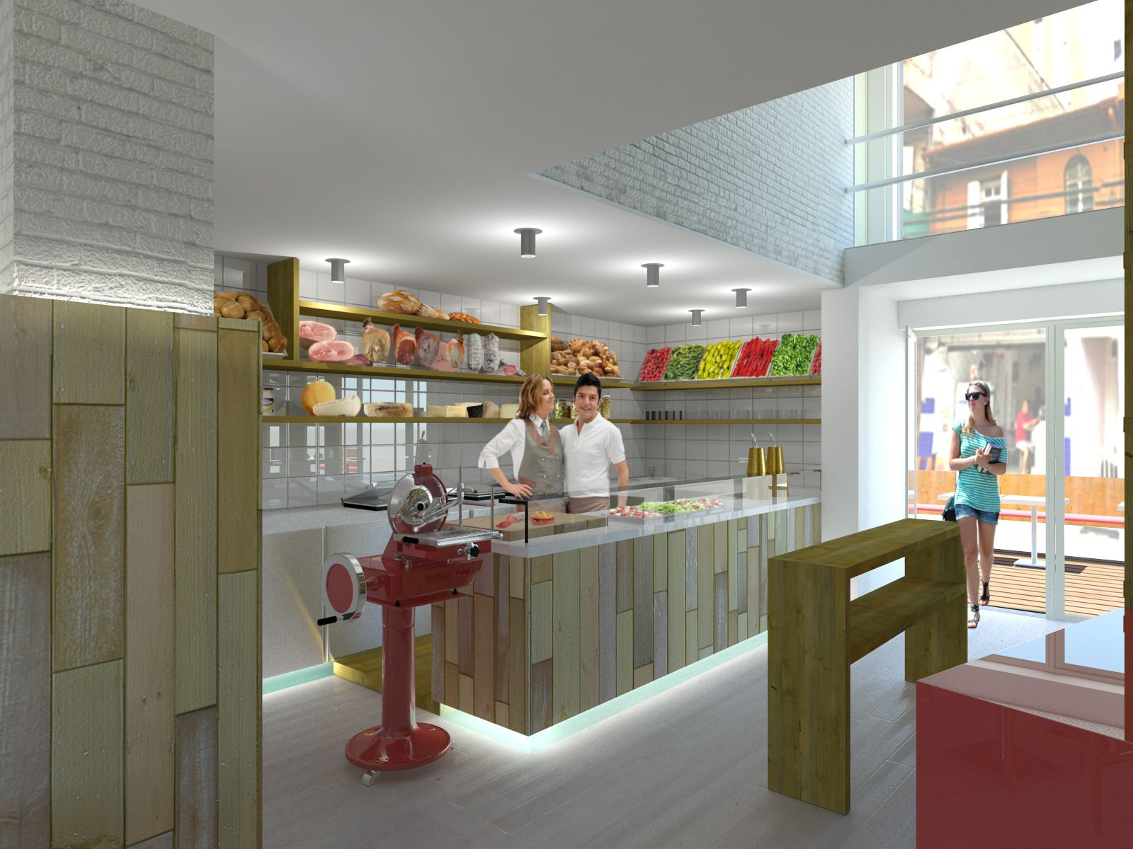
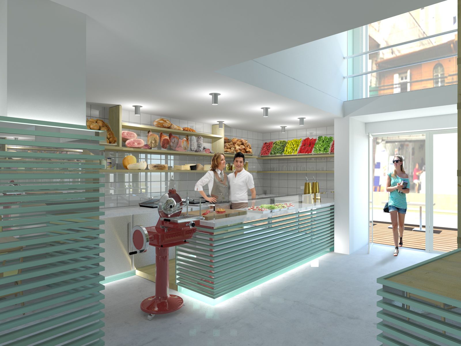
There are two complete sets of renderings of this project, made in the same week of April 2012: the same viewpoints, the same furniture, the same light — and two different claddings.
One is in timber boards of uneven widths, warm, with red seating: the tavern version. The other is in horizontal battens of white and sea green, with backlit glass and green seating: the pale version, almost an ice-cream parlour.
That is not indecision, it is how you let someone choose. In words, «warm timber» and «pale battens» are two adjectives; drawn in full, from exactly the same position, they are two different places to walk into. The same method as the three kitchens of the Chocolate Factory (in Italian): you draw everything twice, and then you choose by looking.
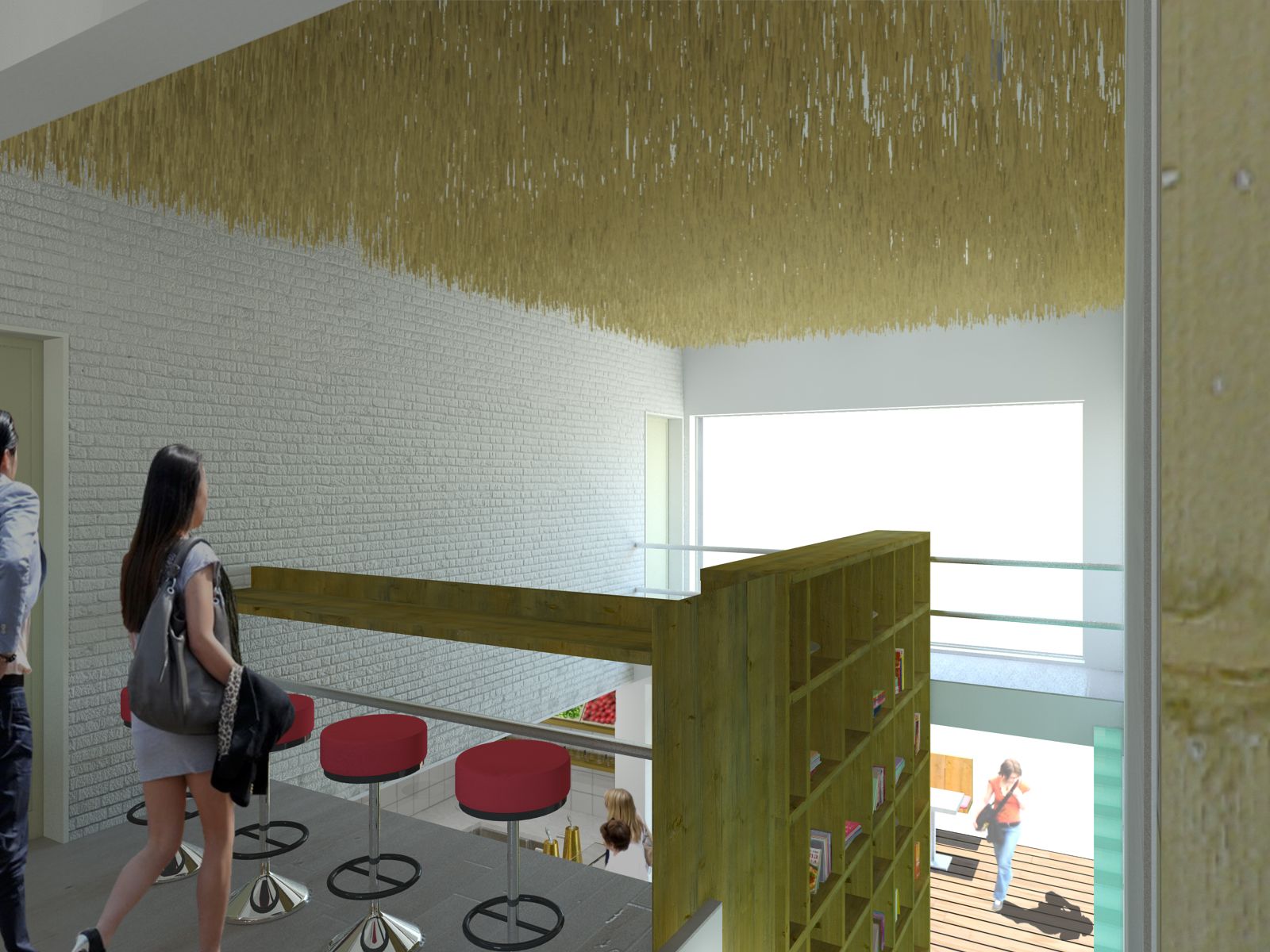
Timber won
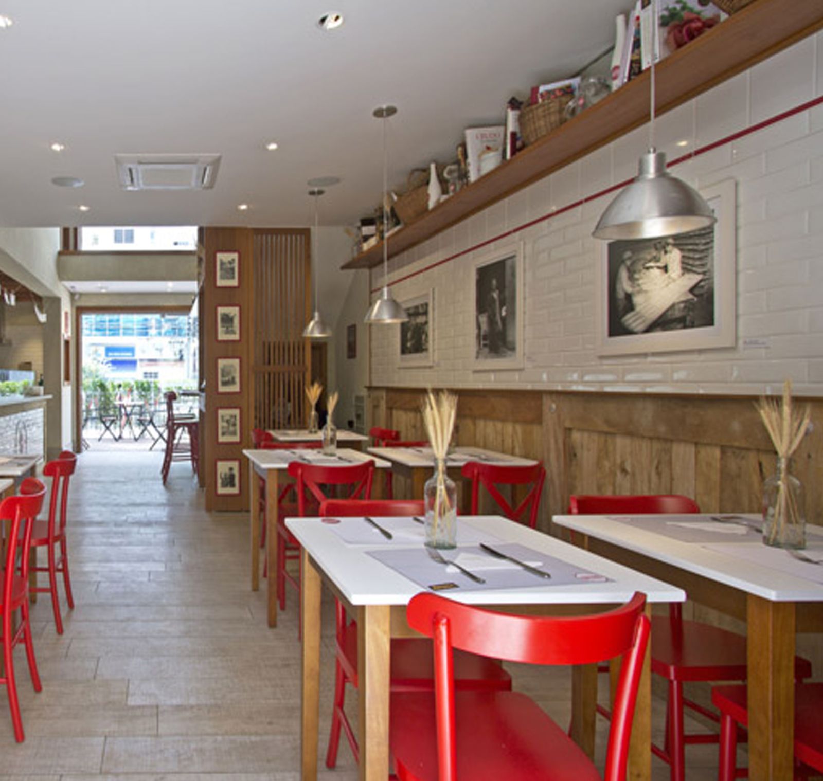
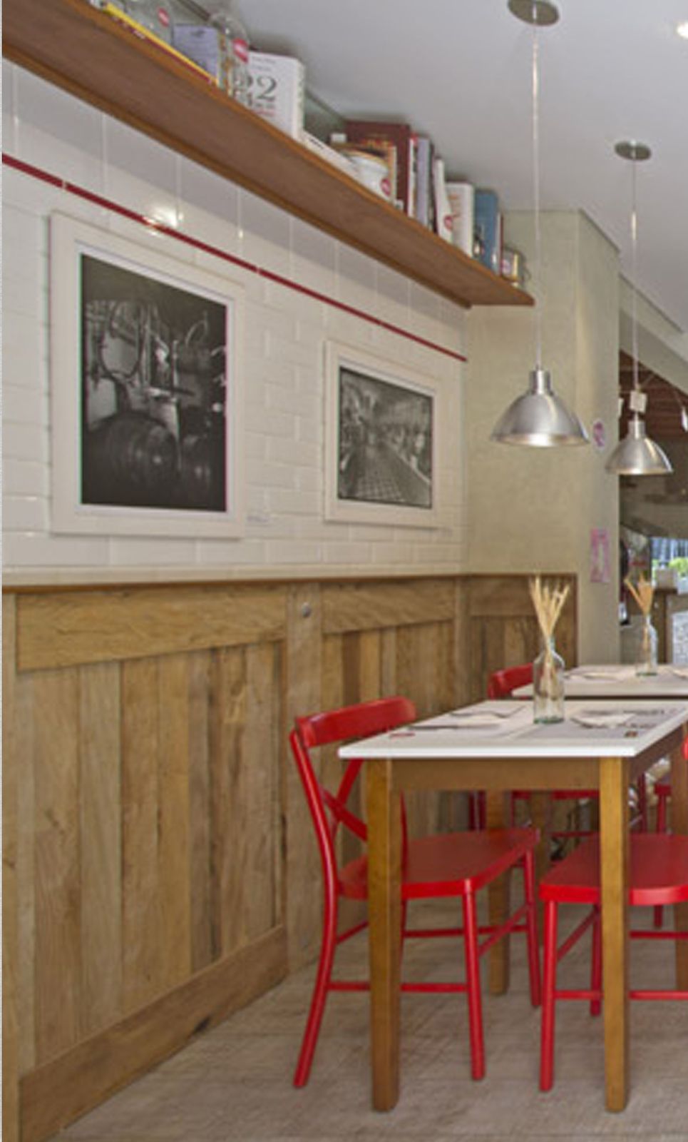
The place opened on 28 February 2013, and of the two versions one went through: the timber boards and the red chairs. As built, the cladding became a metre-high dado of oak boarding, with white metro tiles above it and a red line to close it off. The red line was not in the renderings: it arrived on site, and it is the thing that holds the room together.
Who did what
The project is mine and my father Alberto’s, from the survey of the empty building to the two versions of the cladding. And it was not done from a distance: to do it we rented a space in São Paulo and sat down to draw there.
It sounds like an organisational detail and it is in fact the most expensive decision of the project. A place like this is drawn by looking at the street it stands on — who passes, at what hour, from which direction, and how long they take to decide whether to come in. That street was fourteen hours away by plane: the only way to look at it was to go.
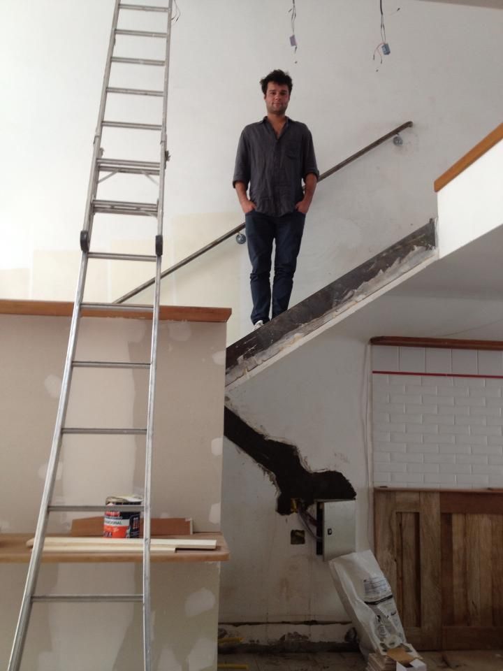
Then the work started, and I followed it going back and forth from Italy. The photograph on the stair, at the top of this page, is from one of those trips: the double-height void is already open and nothing is finished.
The permits were handled locally by Lovisaro Arquitetura e Design; the builder was AMAC Construtora.
Eleven years later, for a flat in Dubai, it went exactly the other way round: no trip at all, four schemes drawn from Milan, and the client on site doing the measuring and the photographing.
Somewhere to put right? Send me a couple of lines about what it is and where, and I’ll tell you what I think, and whether it is worth seeing together.
+39 339 5432622 — VAT 10329750961
Registered with the Order of Architects of Milan, no. 19187 © Matteo Gardino. The projects, drawings and texts are mine; the photographs and renderings are by whoever is credited on each project page.
You are welcome to quote with a link; to reuse anything, please ask me.